|
“Hunderwasser” Self Evaluation critique
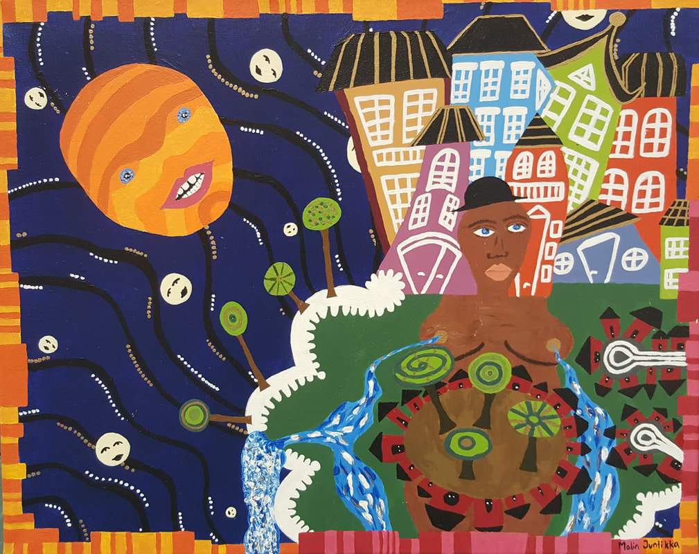
Please answer the following questions for your painting when it is completed. Name: Malin Juntikka 1. Describe the craftsmanship of your painting. (Is it neat and well executed?) My painting is neat. I think I succeeded with the color combinations, and my border is nice. I could have used more painting at some parts, because in some parts you can nearly see the canvas and the underlaying laying. Also, I could have been more careful when I did the details. If you look close you can see that it looks a bit shaky. Many times my hand spead out the still wet color which resulted smash. 2. How does your work embody the artist’s style? I used a lot of colors. Not randomly, without I chose the colors very carefully. I worked a lot with contrast colors. For example, does the border mirrors the colors inside of it. I did not put any shades in the painting, which makes the painting very flat. I mixed straight-up-buildings and flat-buildings. The painting is not realistic at all, but you can still see the natural forms of houses, bodies and curves. I used patterns too. 3. Describe your choice of colors/color harmonies and how you used them throughout the artwork. I used a lots of contrast colors. I love to use those colors, because it makes the painting more powerful. The deep dark blue sky, and its black stripes makes the sky very deep and infinite. The orange sun/moon/face fits perfect in the sky. First I planned that the stars/small faces would have the same color as the sun, but I considered that the white-yellow color ended up better. I wanted the tree/park/mother earth-part to be natural. The contrast to the natural, harmonious and calm park, is the high new buildings consisting of unnatural light-timid-colors. 4. What is the emphasis (focal point) of your artwork? First, it was very clearly that the sun/moon/face would be the emphasis of my artwork, but now when I am done, I am not 100% sure. The colorful buildings and their white windows gives a strong impression too. Though, I still think the sun/moon/face is the heart of the picture. With help of the contrast by deep dark blue sky it becomes the most tempting object for the eyes. But that is my opinion. Other eyes may think something different. 5. How did you use textures and patterns to embellish your artwork? I think the white windows on the buildings fits perfect. First, I was thinking to use the contrast colors, but after painting the first layer with white colors I saw how beautiful they fit together. The increasing paint strains on the river gives you the feeling that the water goes faster and faster until it all split up by the waterfall. I used a lot of painting to the river. It makes it livelier. The small dots in the sky reinforces the texture in the sky. 6. How did you put a border on your artwork? How does it enhance the work? I decided to make a discontinuous border. The way it enhances the painting is that it mirrors the inner colors. It gives the contrast color to the color inside. By that process, the painting amplifiers. The “Island” ends i the right down corner, so does the red/pink boder. In order of that, it makes it more clear that the border mirrors the inner colors. 7. Describe any difficulties you had creating this artwork. It was annoying that you needed to put on so many layers. But, it is still quite satisfying to see how it ends up better each time. I do not like to be super detailed and meticulous, so sometimes it was hard to do all the patterns. I am neither so careful when I painting. But with help of the white color that covers the under layer very well I managed it!  I started to draw my sketch on the canvas.
1. What watercolor techniques proved to be effective in your painting? How and Why?
The drybrush-technique was most effective in my painting. I needed that technique for the textures (grass, trees, etc.). I also like it to be strong and colorful. 2. How important was using transparent layers in your painting? It was not so good. I wanted my colors to be strong, which they now are, but it is not the “true-technique” of color painting. It may has fitted my clouds, because they are light. 3. Explain how your composition was successful? Did you utilize all the elements of art and principles of design? Explain. I think my composition was successful. I did use some elements of and principles of design. Surely, I could have been better of focus on that. I mostly thought that the painting would look as much as the original picture as possible. 4. Was color choice an important factor in the overall success of the painting? Why? The color choice was a very important factor in my painting. I really want that people should feel the same warmness as I do when I look at the picture. And to feel that they are standing in Swaziland. 5. Describe your craftsmanship. My craftmanship is a colorful landscape consisting of a broad plain that stretches to the shady mountain range. In the middle of the plain is an orange colored road stretched out. Above the mountain range is a clear blue cloudy sky. 6. If you were able to do something different what would it be and why? I would have changed the colors on the mountain range(again). I think the colors are too light. It does not fit for the dark-blue-green colors (shadow) on the mountains. I also wish that I had discovered the other blue color before I started to paint. Next time I will me more meticulous when picking colors. In that case, I think my result had been much better, because now my clouds look quite weird. I would also have been more careful when painting. Usually I had less water than I needed, which made the paper messed up. 7. Explain to me what you have learned about watercolor and how it has improved or discouraged your development in art. I have learned that it is very important to use the right amount of color and water. Otherwise, the whole painting destroys. After the project, I am now even better to mix colors. And I have an better eye to discover other color decisions and techniques. For example, I have realized that dark blue can work as a shadow.
  This is my result. I am not superduperhappy, but I still think I did a great job. It was much harder than I tought it should be, especially to found tha right colors to the mountains and to build the clouds. If I had discovered the other blue color, I believe that my result would have been better. I am most proud of the grass-road-area:) This was a really fun project!
 In our first project we were supposed to paint a picture of our own with water colors. I decided to paint a picture of a landscape from Swaziland. We did not need to use the same colors, but I tried to make it exact as much as possible. I really love the colors in this picture, so I wanted to keep them. I decided already in the beginning that it would be too hard and detailed to draw my family, so I deleted them from the picture. But I kept the zebra and some buffalos. 
 I continued to start the painting process! I wanted to make the half of the picture as done as possible before I continued with the rest. I started to paint kind of the same shades I wanted to have in the end. I did this part, just to have a better perception on how the result would be and to see all the colors together. My process when I painted was to: Firts put some almost likely colors on the paper, put more likely colors, paint the darker parts, paint the lighter parts, shade, and lastly texture. Klicka här när du vill redigera.  Then I started to build the mountains. It was very hard to found the right colors. I did not discover the other blue color until the Friday, so that is one reason why I did not get the right colors. I did the same process as on the ground. On this picture I have just started to fill in the right part of the mountains the second time, and some of the trees. Personally, I think that this part in the painting process is the funniest. It is cool to see what diffrent shades can do.
|
SkribentI am a Swedish exchange student that is spending the school year 2017/2018 in Apex. Arkiv
Januari 2018
Kategorier |


 RSS-flöde
